“The temple of art is built in words.”—Josiah Gilbert Holland
Lately, I’ve been seeing a lot of startup pitch decks that are loaded with beautiful graphics that confuse me. I’m not sure who decided that pretty graphics improve your pitch, but sometimes they don’t. More and more, I find myself telling entrepreneurs, “Sometimes a word is worth a thousand pictures.”
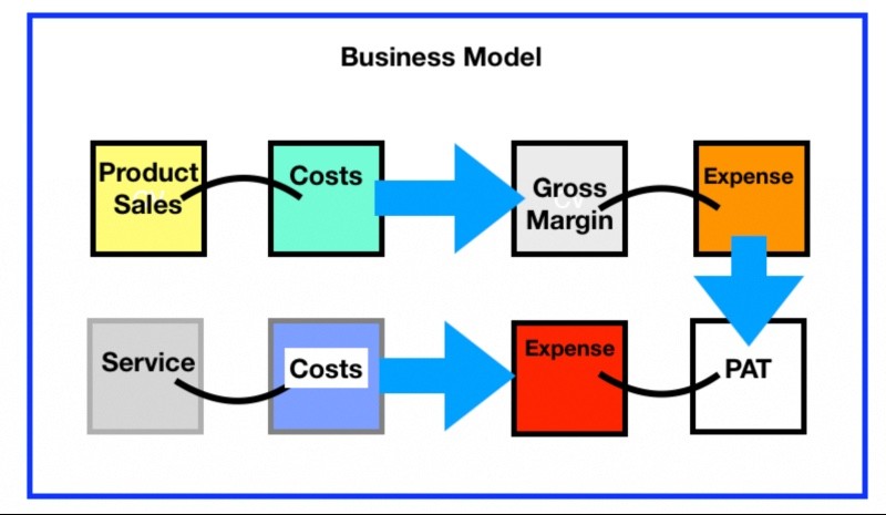
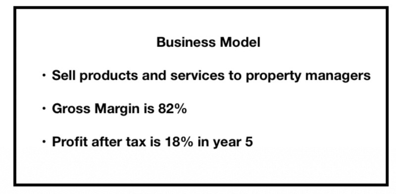
Here’s an example. Would you rather see this:

Or this?

Sometimes a few well-chosen words can be much punchier and to-the-point than the most beautiful graphics. Besides, there are some reasons to favor words over graphics in your pitch deck.
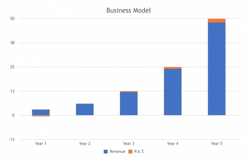
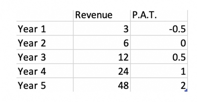
On the other hand, you might rather see this:

Than this:

Some graphics help to clarify your message, but some just make things more complicated.
“Make your work to be in keeping with your purpose”― Leonardo da Vinci
Should a Pitch Deck “Stand Alone?”
There are several reasons that your pitch deck should be fairly self-explanatory—that is, not require someone to explain every slide.
First and most important is that your pitch deck is often the “face” of your startup. It’s the first thing investors see. It is highly likely that investors will see your pitch deck before they see you, so it needs to make a great first impression. Investors don’t care about your use of color or clever graphic constructs. They care about the content of your message. What’s your great idea, and why does it deserve funding? Who are the people who are going to make your startup work?
Investors frequently tell startups, “Send me a copy of your pitch deck, and I’ll follow up.” What they are really saying is, “I’m really busy so I’ll take a quick look at your pitch deck and decide if it would be good use of my time to meet with you.” If they’re faced with complicated graphics that need explanation, they won’t get the message. The important content needs to be stated in words that are so clear they “jump off the page.”
A second reason your presentation should stand alone is that even if an investor hears your explanation of the graphic illustrations, he or she might use a hard copy of your pitch deck as a reminder several weeks later. And you won’t be there to explain the graphics.
It’s also common for investors to forward your pitch deck to their partners or other investors, and they won’t have the benefit of you standing there to explain the graphics.
“So the writer who breeds more words than he needs, is making a chore for the reader who reads.” – Dr. Seuss
Other Mistakes Startups Make with Their Pitch Decks
It’s important to be realistic about how pitch decks get used. They are not just used in front of audiences with large high-definition color displays. For example, many investors will simply print a copy to put in his/her reading stack—very possibly on a black and white printer—which means the investor won’t see your pretty color graphics.
Another thing that drives me crazy is the “white on black” format. These plans often do not get read because they are difficult to print. They require an enormous amount of printer toner (or ink) and the contrast is not as readable as black on white. The same is true of slides that have a busy background. They are more difficult to read when printed on paper. All in all, for readability, it’s difficult to beat simple black text on a white background, stodgy as it may seem.
“Bulleted lists are an easily scannable way to present multiple points.”—Pamela Wilson

Text Doesn’t Mean Sentences
The mistake some companies make in the “other” direction is to write out entire sentences or paragraphs. This is just as distracting an incomprehensible graphics. You don’t want your audience reading text while you are explaining your concepts. It’s best to use bulleted phrases with just a few important words that convey the essence of your idea. Four to six bullets on a page is about the limit, with each containing a maximum of about half a dozen words. The text gives you your talking points when presenting but it doesn’t distract the audience; hopefully it augments what you are saying.
Plans Always Change
“The best laid schemes o’ mice an’ men / Gang aft a-gley.”—Robert Burns
Another reason for using bulleted text is that it is extremely easy to change, and business plans and pitch decks are notorious for requiring frequent revamping. Before preparing a pitch deck, my companies prepare an “internal” business plan in bulleted form. Its purpose is to help the entire team communicate about the essential ideas, assumptions, and plans for the business. A portion of it might become the pitch deck in the future, but its main purpose is internal communication and it is constantly changing.
“It’s just better to be yourself than to try to be some version of what you think the other person wants.”—Matt Damon
Who Wrote Your Business Plan?
Another concern I have about elegant pitch decks is that they beg the question, “Did you use a third party to create your pitch deck?”
To me, this is a pretty big negative. I would like to think the team I am investing in has the skills to prepare its own business plan.
- What does it say about the team if they have to hire a third party to write their plan?
- Do they not know how to plan?
- Are they not effective communicators?
- What happens in the future when the plan changes?
- Will they outsource the changes?
Startups often need help in crafting their business plan and pitch deck, but the plan should be their own, and the assistance should focus on creating an effective structure and making certain that the essential messages are conveyed clearly.
Conclusion
Your pitch deck can only be as good as the substance of your message. No quantity of graphics or pretty pictures can paper over an idea or a management team that is not fundable. On the other hand, it is possible to have a very strong and substantive case for your idea and your management team and hide it behind confusing language and graphics that are not that are difficult to understand.
Remember your audience and make your message crystal clear.


Recent Comments